Roundhouse Provisions
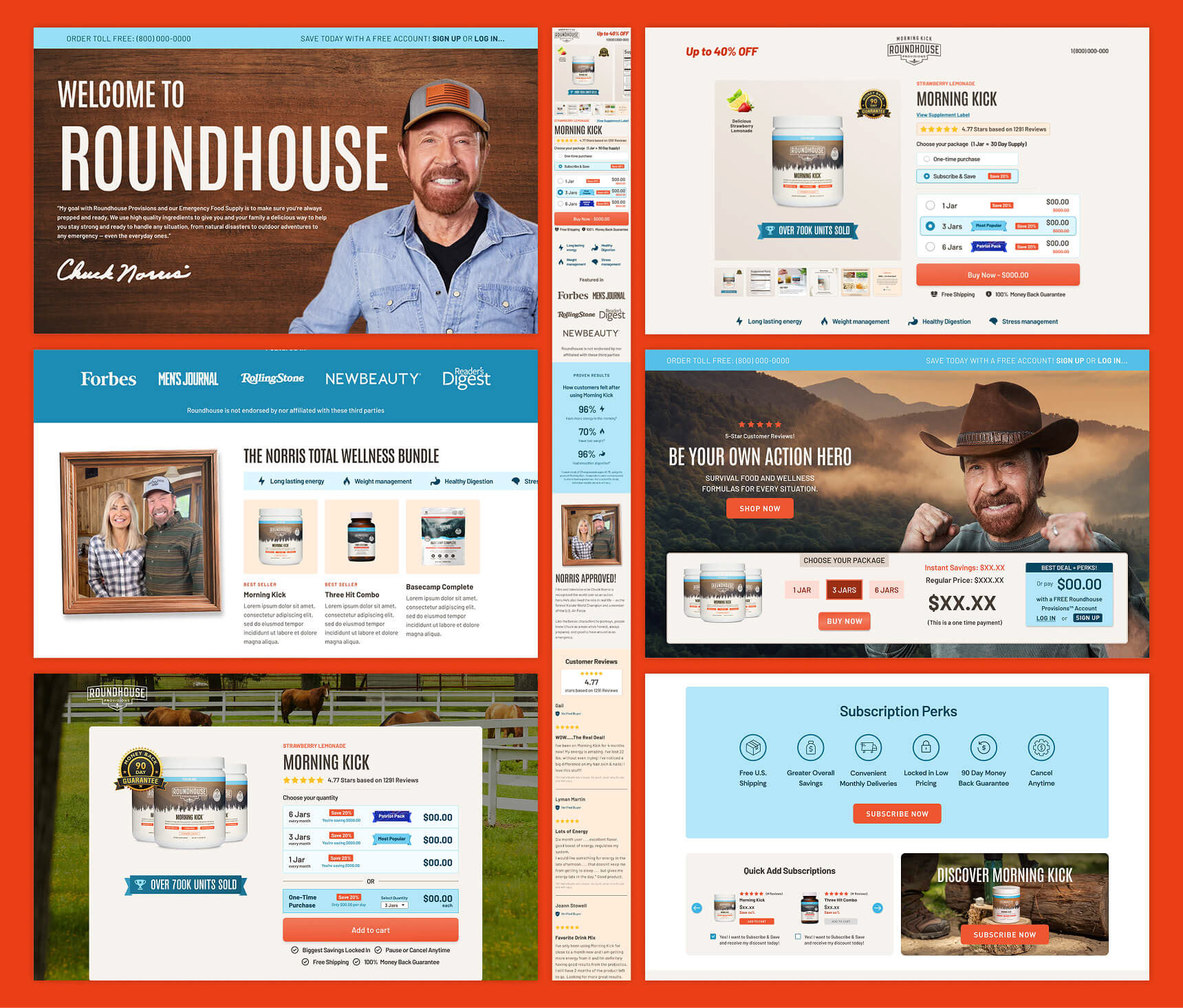
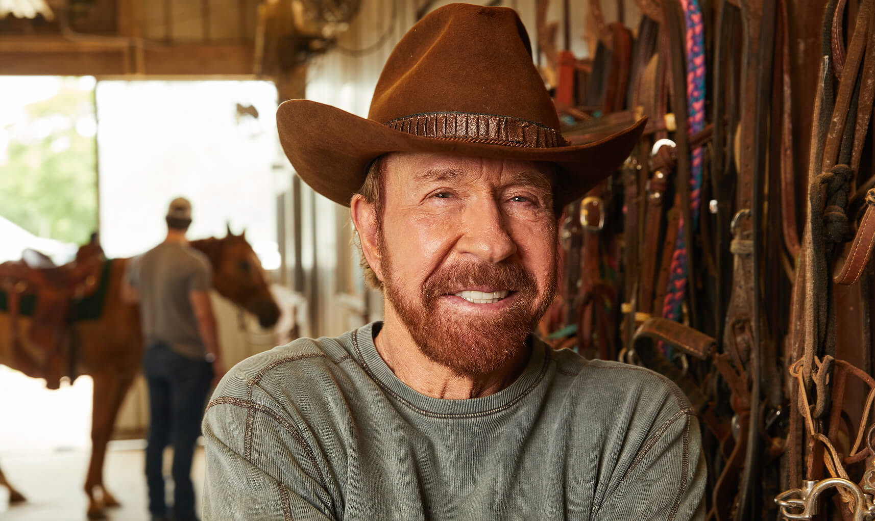
Roundhouse is an emergency food supply and supplement brand by American icon Chuck Norris. For this project, I developed a full brand identity system from logo and packaging to website design—crafted to reflect Roundhouse’s rugged spirit and patriotic foundation. The visual direction combines outdoor grit and adventure with bold typography, a powerful red, white, and blue color palette, and design elements inspired by American heritage. The cohesive branding system not only elevated Roundhouse’s presence in a competitive market but also helped drive real results, contributing to the sale of over one million units of its hero product, Morning Kick.
Logo Design
The Roundhouse logo is built to feel authentic, strong, and rooted in American grit. The icon draws inspiration from Chuck Norris’ ranch—an emblem of hard work and self-reliance—while the bold, utilitarian typography reinforces durability and trust. Everything is framed within a border shaped like a classic Western general store sign, a timeless symbol of dependability and supply.
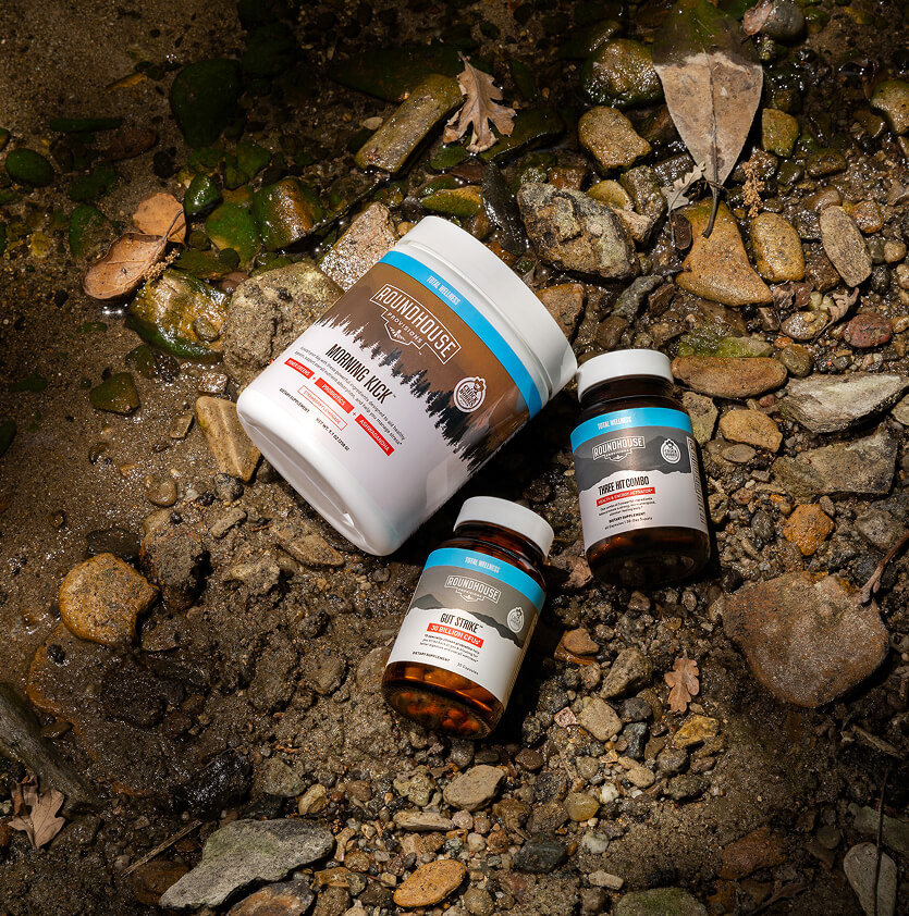
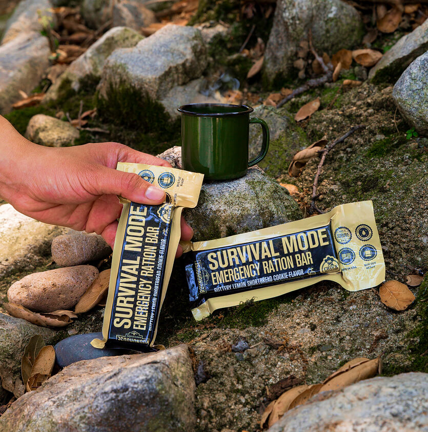
Packaging
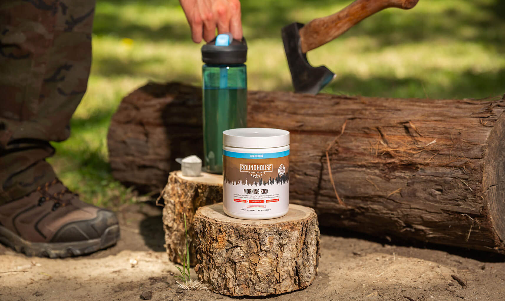
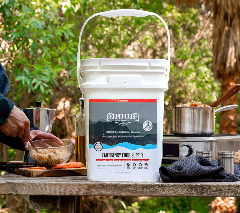
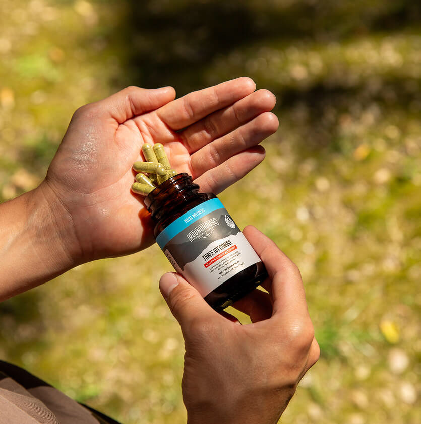
For the packaging, we brought in an outdoors feel using a bold mountain silhouette and unique landscape imagery for each product. The copy and benefits are clean and easy to read, making information quick to digest. To clearly separate product categories, we used a simple color system: primary red for the top bar on emergency food and secondary blue for supplements. This keeps the packaging functional, recognizable, and true to the Roundhouse brand.
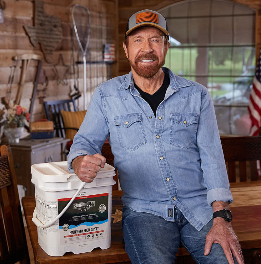
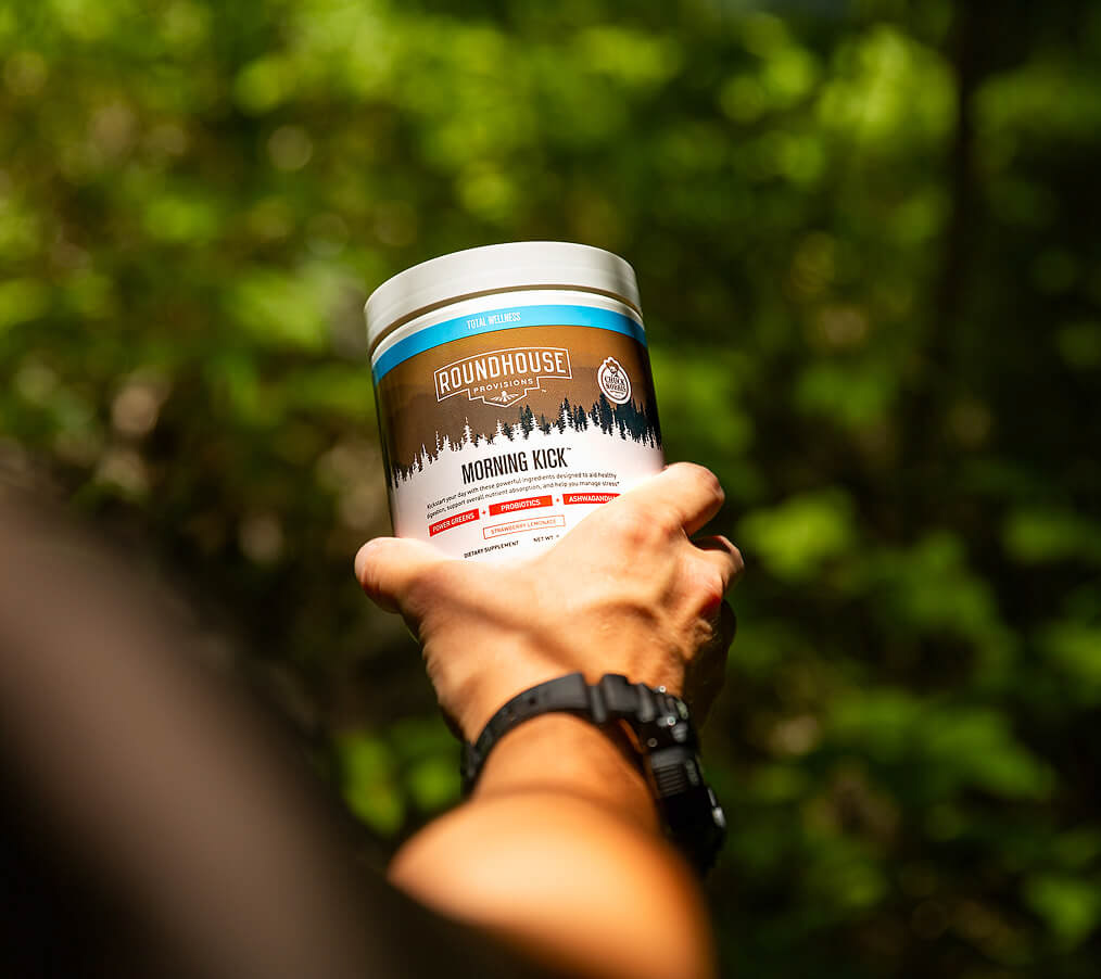
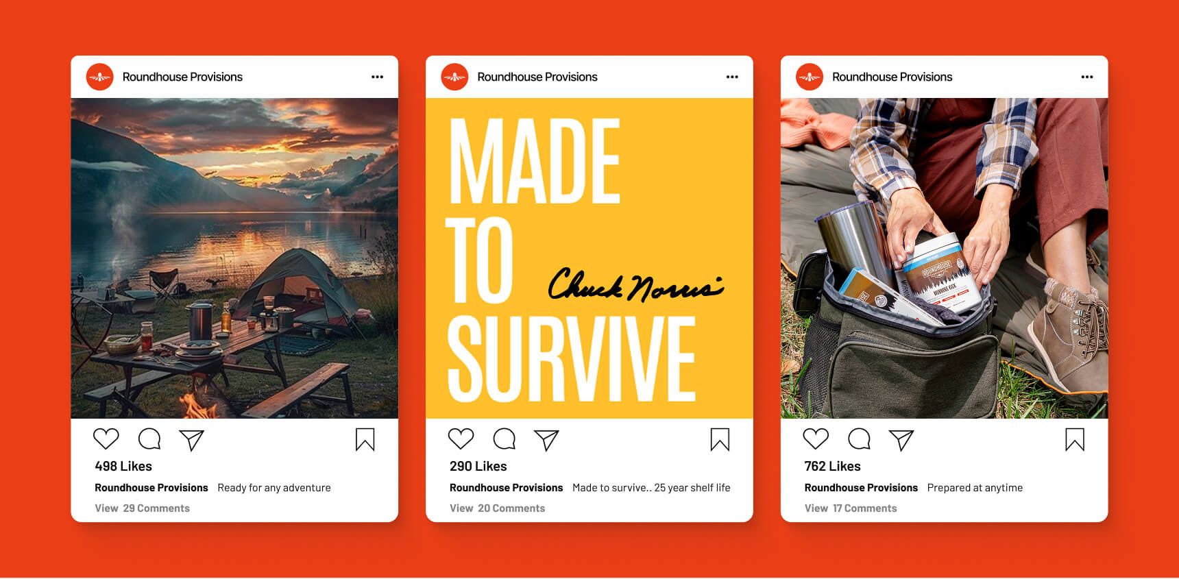
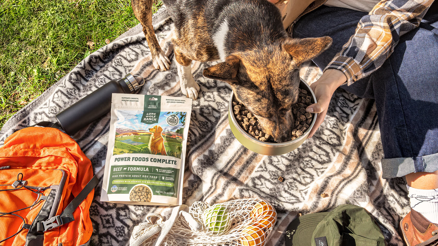
Photography Direction
For the photo direction, we showcase Roundhouse products up close and centered in a strong, heroic style. Most shots are captured outdoors to stay true to the brand’s rugged, adventure-driven aesthetic. Bold compositions and high-contrast editing give the imagery a powerful, attention-grabbing look that reflects the strength and confidence of the Roundhouse brand.