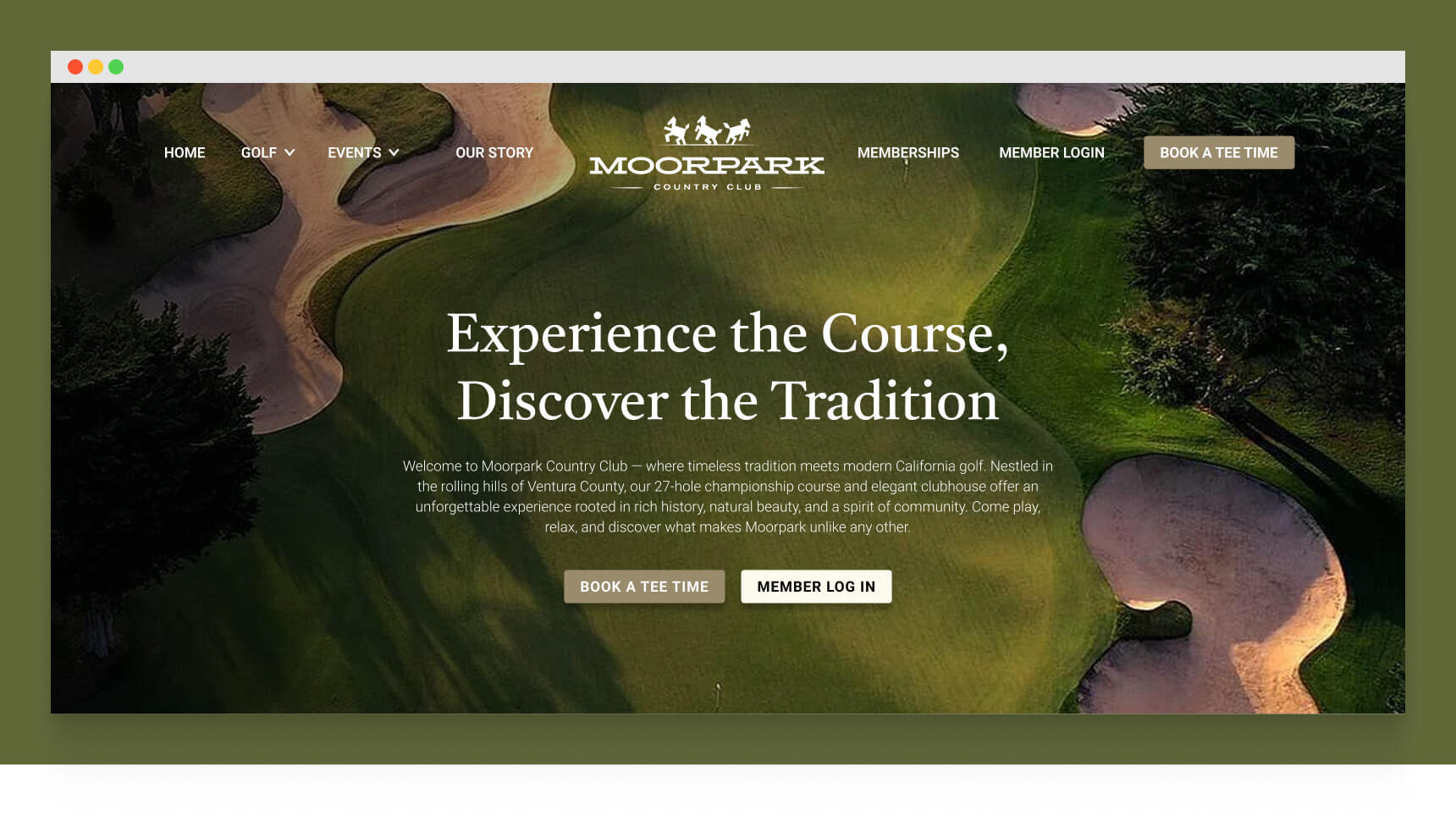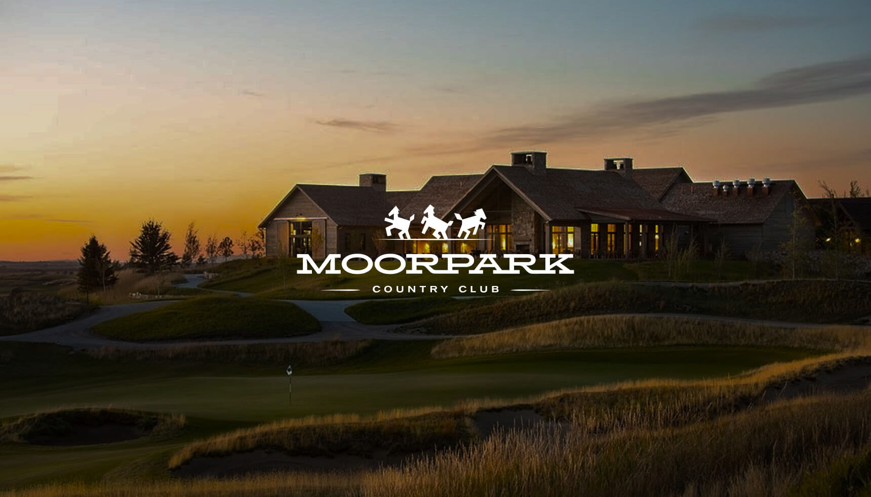
Moorpark Country Club
We rebranded Moorpark Country Club to better reflect who we are today while honoring where we came from. As the game evolves and a new generation of golfers emerges, we saw an opportunity to modernize our identity—bringing fresh energy to our visual presence while staying true to the land’s deep equestrian heritage and the spirit of community that defines us. The new brand bridges past and present, inviting more people to experience everything that makes Moorpark special.
Old Logo
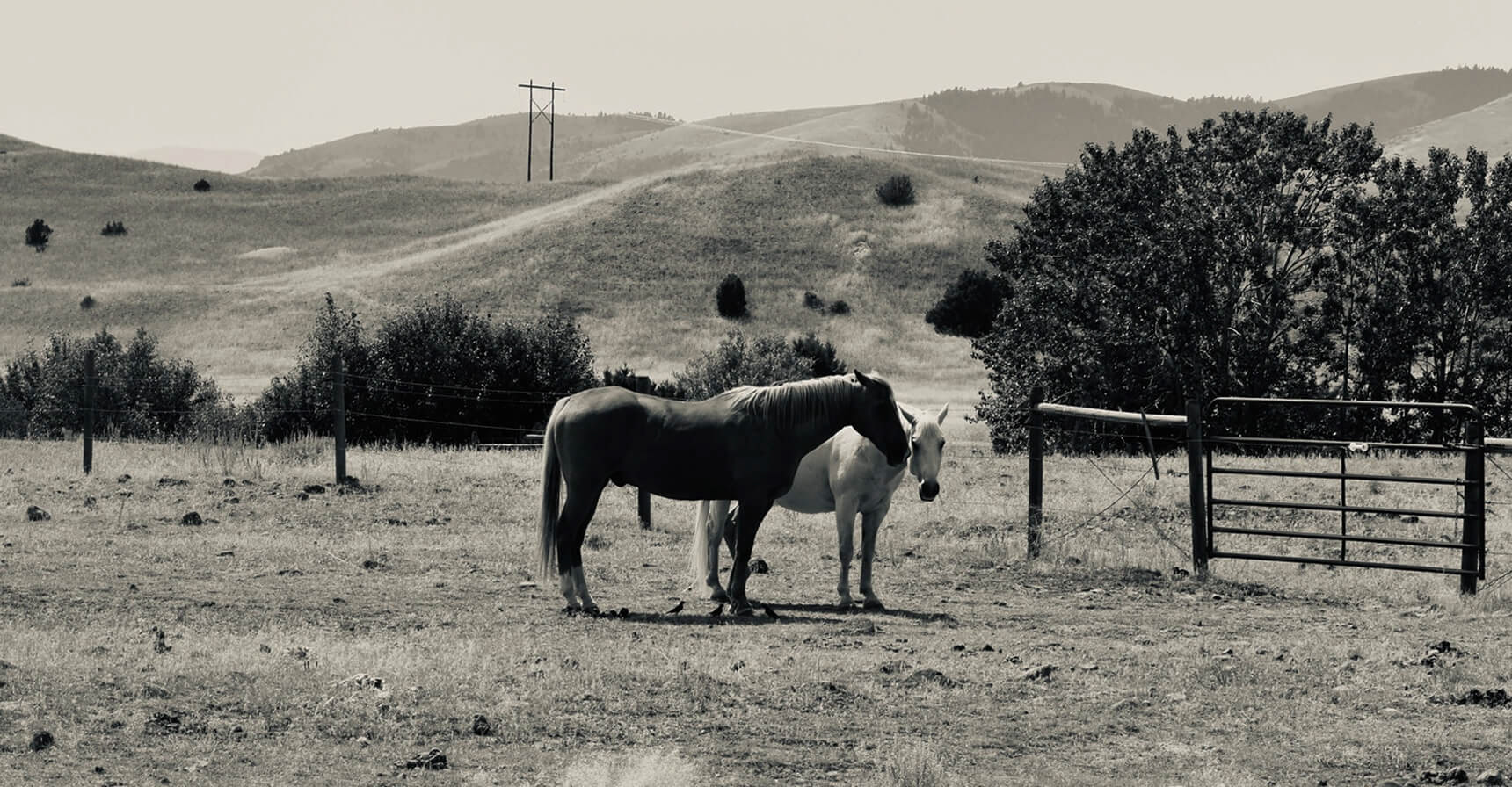
Moorpark’s history is deeply rooted in its equestrian heritage, with horses playing a vital role in shaping the land, lifestyle, and community. From ranching traditions to open countryside, the area’s identity has long been defined by its connection to horseback culture and the rhythm of life it inspired. Although the old logo has horses it does not reflect the aesthetic and feel of the old tradition.
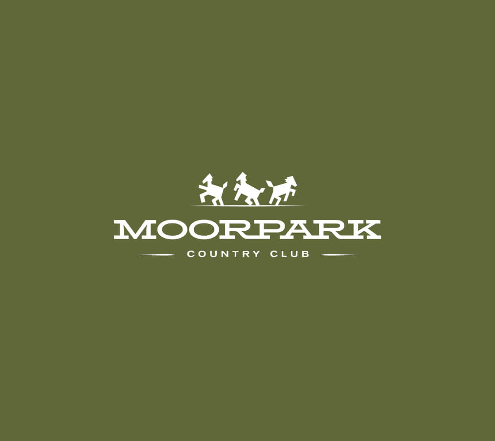
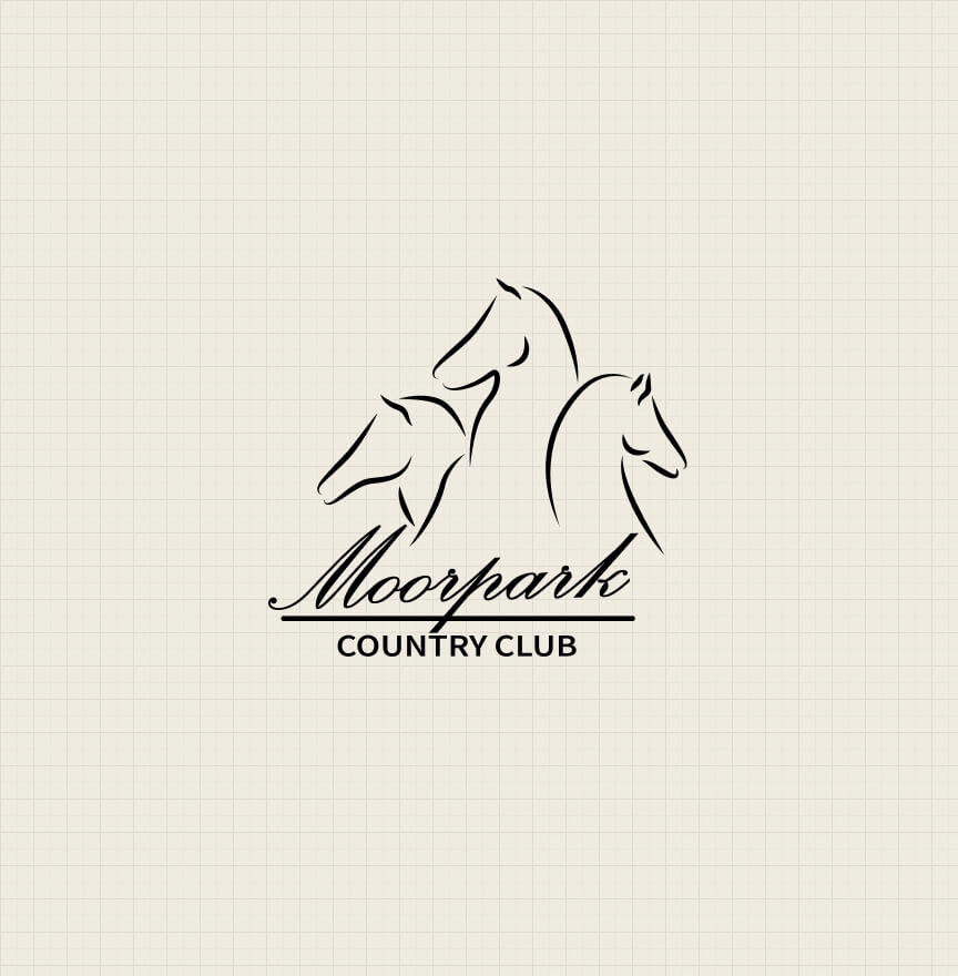
New Logo
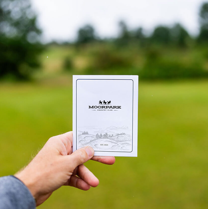
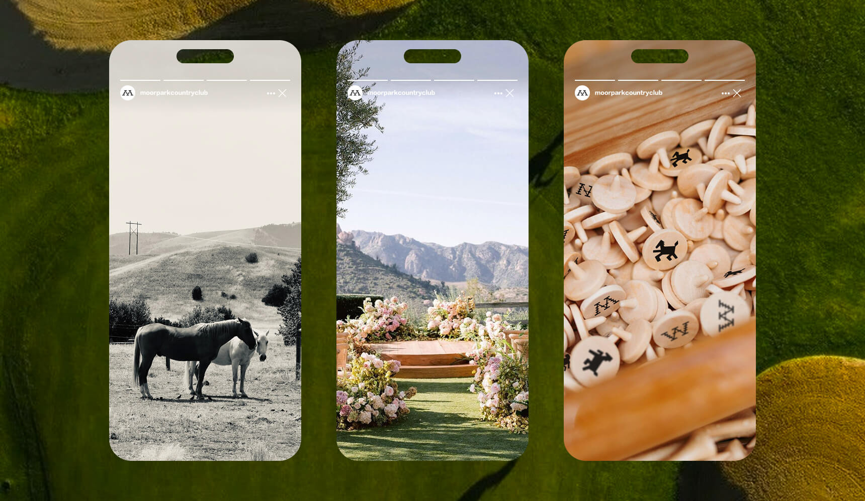
The new logo mark features three bold horse silhouettes, a nod to Moorpark’s deep equestrian roots and a symbolic representation of the club’s 27-hole layout—three distinct nines woven into one unforgettable experience. The solid, simplified forms give the horses a modern edge, creating a mark that feels strong, iconic, and more relatable to a younger audience, while still honoring the area's heritage. We chose a typeface that’s clean and refined, offering clarity and elegance, but with subtle character that nods to tradition. Together, the mark and typography strike a balance between legacy and progress—just like Moorpark itself.
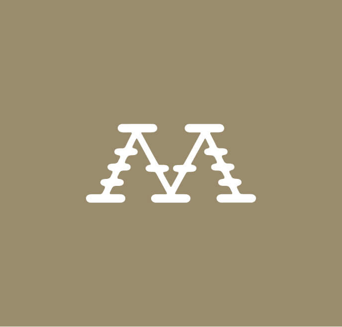
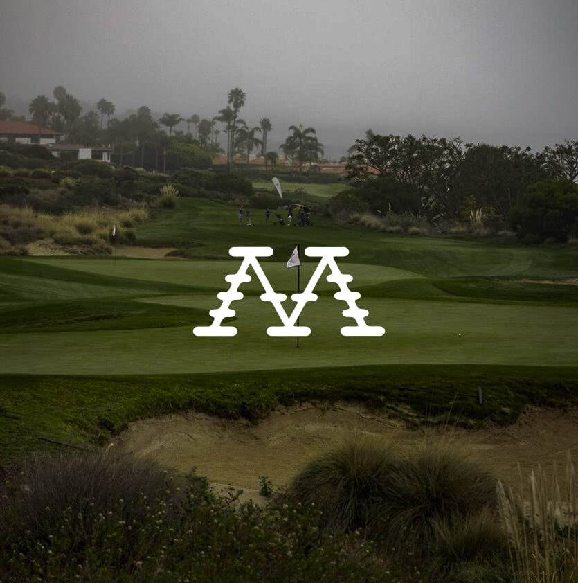
Secondary Logo
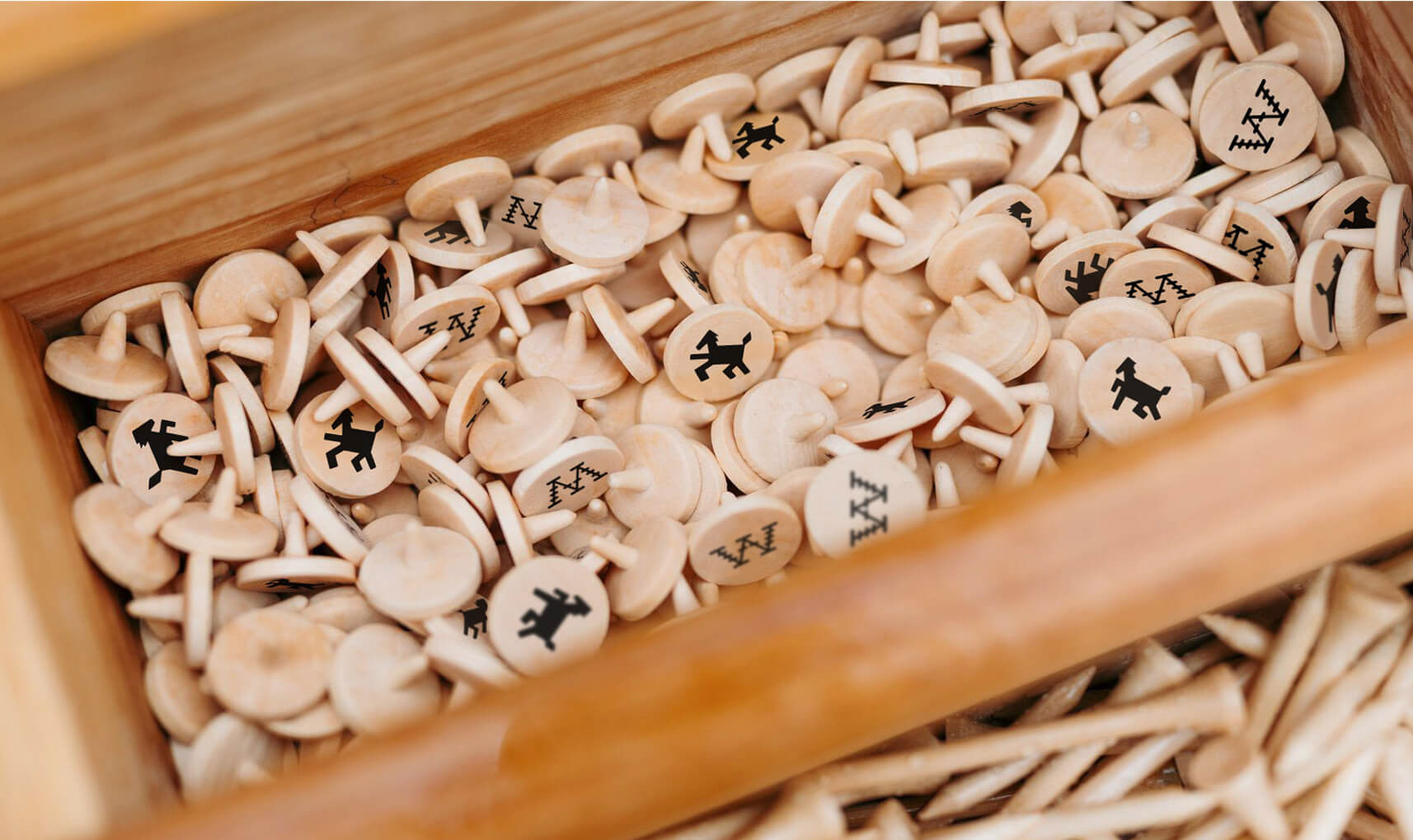
The secondary logo mark is a stylized “M” designed for versatility in smaller spaces while still carrying the strength of the brand. Inspired by traditional horse branding irons, the mark features subtle notches that echo the shape of ranch gates and corrals—tying directly into Moorpark’s ranching heritage. Its bold, minimal form ensures it stands out at any size, making it ideal for hats, scorecards, and social icons.